Source Code

Overview

The TL;DR

Architecture

  • Astro 5 + React islands where interactivity matters
  • Static-first; hydrate only what's needed
  • Assets: width hints for images; subset/preload fonts

Agentic development

  • Pair-program in Cursor under versioned `.cursor/rules`
  • Plan → Act → Review; apply diffs with checkpoints; confirm commands
  • Architecture sessions map modules and flag boundary violations

Styling

  • Tailwind v4 with `@theme` tokens and composed utilities
  • No arbitrary values unless truly unavoidable (e.g., layered shadows/backdrop)
  • Single Storybook across apps/packages; titles show ownership

Content

  • Keystatic + Zod for typed content end-to-end
  • Builds fail fast on bad data
  • Keystatic schemas mirror Zod for edit-time + build-time validation

Animations

  • Flateralus (PIXI 8) with typed controls
  • Visibility-based pausing
  • Guardrails (caps) to protect frame budget

Philosophy

  • Prefer constraints and clear boundaries
  • Keep the toolchain boring, the types strong, and the pages fast
  • Target near-perfect Lighthouse scores across Performance/Accessibility/Best-Practices/SEO
Architecture

Architecture At A Glance

  • Static first. Pages render statically in Astro; islands mount React only where interaction or animation adds value.
  • Typed content. Content shapes live in Zod. The build fails on bad content rather than shipping surprises to production.
  • Clear boundaries. Apps depend "down" on packages; packages don't reach back into apps.
  • Assets. Images get width hints and sensible defaults; fonts are subset.

System Flow

User CDN
CDN Astro Static Pages
Astro React Islands (hydrate as needed)
Astro Keystatic Build (Zod typed)
Islands Flateralus Runtime (PIXI 8)
Astro Image/Asset Pipeline
Performance

Performance & accessibility

Targets

Lighthouse Results:

  • Performance: 99/100 - Near-perfect Core Web Vitals
  • Accessibility: 100/100 - Full WCAG compliance
  • Best Practices: 100/100 - Security and modern web standards
  • SEO: 100/100 - Optimized for search engines Core Web Vitals:
  • LCP ≤ 1.2s (Largest Contentful Paint)
  • INP ≤ 50ms (Interaction to Next Paint)
  • CLS = 0 (Cumulative Layout Shift)

How I get there

Performance Strategy:

  • Static-first architecture with Astro; selective React hydration only where needed
  • Optimized images with width hints, modern formats, and responsive sizing
  • Font optimization with subset loading and preload hints
  • Animation controls that pause when not visible to preserve frame budget
  • Bundle optimization with tree-shaking and code splitting Accessibility Approach:
  • Semantic HTML with proper heading hierarchy and landmarks
  • ARIA labels and roles for complex interactions
  • Keyboard navigation support throughout
  • Color contrast meeting WCAG AA standards
  • Screen reader compatibility with descriptive alt text
Structure

Mono-Repo

I'm a firm believer in mono-repos. Until the bird is ready to fly on its own, it should stay in the nest with the rest of the flock. This methodology keeps your features contained in one project's PRs and keeps everything in lock-step.

Apps and packages are separated and linked to each other in the respective package.json files. Here's an auto-generated list of the apps and packages when this website was built:

Repository Structure

A monorepo containing 3 applications and 14 shared packages.

Apps (3)

  • bracketbear-website
    Main company website for Bracket Bear, built with Astro and integrated CMS
    apps/bracketbear-website
  • cms
    Keystatic CMS for Bracket Bear
    apps/cms
  • portfolio
    Personal portfolio website showcasing projects, work history, and skills
    apps/portfolio

Packages (14)

  • astro-content
    Content management utilities for Astro with CMS integration, image handling, and Vite plugin support
    packages/astro-content
  • bear-ui
    Core UI system for BracketBear applications
    packages/bear-ui
  • bear-ui-react
    React components for BracketBear UI system
    packages/bear-ui-react
  • bear-ui-tailwind
    Tailwind CSS styles and utilities for BracketBear UI components
    packages/bear-ui-tailwind
  • cms-mcp-server
    MCP server for Bracket Bear CMS content
    packages/cms-mcp-server
  • core
    Core utilities and Astro components for BracketBear applications
    packages/core
  • flateralus
    Flateralus animation engine.
    packages/flateralus
  • flateralus-p5
    p5.js adapter for Flateralus animation framework.
    packages/flateralus-p5
  • flateralus-p5-animations
    p5.js animations for Flateralus framework
    packages/flateralus-p5-animations
  • flateralus-pixi
    PIXI.js adapter for Flateralus animation framework.
    packages/flateralus-pixi
  • flateralus-pixi-animations
    PIXI.js animations for Flateralus framework
    packages/flateralus-pixi-animations
  • flateralus-react
    React bindings for Flateralus animation engine.
    packages/flateralus-react
  • schemas
    Zod schemas for content validation and TypeScript type generation
    packages/schemas
  • tw-pattern-analyzer
    Tailwind CSS pattern analyzer for identifying and optimizing CSS usage across the monorepo
    packages/tw-pattern-analyzer
Type System

Contracts & Types

We are TypeScript-first. Apps and packages expose explicit, well-documented types. We depend on interfaces, generics, and factory types to keep implementation details decoupled from contracts. We never use any; we strengthen types to fix errors.

Interface-first contracts

Define interfaces for public APIs; keep implementations behind them. This enables framework-agnostic cores and multiple adapters (e.g., PIXI, p5).

export interface Application<TContext = unknown> {
getContext(): TContext | null;
init(container: HTMLElement): Promise<void>;
start(): void;
stop(): void;
destroy(): void;
}
export type ApplicationFactory<TApp extends Application> = (options?: unknown) => TApp;

Generics for control surfaces

Animations and hooks accept generic control types so UIs get end-to-end type safety without casting.

export function useAnimationStage<TControlValues>(options: { factory: (controls: TControlValues) => unknown }) {
// ...
return {} as { controls: TControlValues };
}

Content Model Integration

I keep content inside the type system. Editors work in Keystatic; Zod validates at build; components consume typed props. Keystatic schemas mirror Zod schemas in @bracketbear/astro-content so content is validated at edit-time and build-time.

// CMS Schema (Keystatic)
// apps/cms/src/schemas/page.ts
export function makeBasePageFields() {
return {
title: fields.text({
label: 'Page Title',
description: 'The main title for this page'
}),
metaDescription: fields.text({
label: 'Meta Description'
}),
canonicalUrl: fields.text({
label: 'Canonical URL'
}),
noIndex: fields.checkbox({
label: 'No Index',
description: 'Exclude from search engines'
})
};
}
// Zod Schema (Astro)
// packages/astro-content/src/schemas/page.ts
export const basePageSchema = z.object({
title: z.string().optional(),
metaDescription: z.string().optional(),
canonicalUrl: z.string().url().optional(),
noIndex: z.boolean().default(false)
});
export type BasePageData = z.infer<typeof basePageSchema>;
AI Pairing

Agentic Workflows & Pair-Programming

I pair-program with Cursor's Agent and keep it on rails with project Rules. The Agent plans first, shows a to-do list for longer changes, and proposes diffs I can accept or reject. Rules make those diffs align with how this repo is built.

How I use it

  • Plan → Act → Review. Ask for a plan, let it break work into steps, then apply changes with diffs and checkpoints. If a step needs the terminal, I confirm the command first.
  • Architecture sessions. I'll have the Agent map modules, call out boundary violations, or sketch migration steps before touching code.
  • Guardrails. Project Rules live in .cursor/rules and are scoped to directories, so the Agent follows the same constraints I do.

Pair-programming protocol (how I keep it predictable)

  1. State the outcome. "Refactor X into package Y, keep public API stable."

  2. Ask for a plan. Agent produces a to-do list; I tweak it if needed.

  3. Apply with diffs. I review and accept in chunks; checkpoints let me roll back.

  4. Run commands with confirm. Anything destructive or long-running asks first.

  5. Exit criteria. Tests pass, boundaries hold, tokens respected, and the plan's boxes are all checked.

Project Rules (excerpt)

.cursor/rules mdc
---
description: Frontend styling rules
globs:
- "apps/portfolio/**"
- "packages/ui-kit/**"
alwaysApply: false
---
- Tailwind v4 only with `@theme` tokens. No arbitrary values.
- Prefer composition over overrides; if a utility needs `!important`, the API is wrong.
- Keep panels/cards/code blocks on the same surface/radius/shadow set.
@tokens.css
Design

Styling

Tailwind gets a lot of heat. I like it because utility-first development enforces a design system. With tokens, spacing and color stay consistent; with utilities, usage is analyzable. I also compose custom utilities (e.g., button, px-content, glass variants) with @apply so the markup stays clean and consistent across the app.

Rules I follow

  • No arbitrary values unless there's truly no other option.
  • All color/spacing/radius come from `@theme` tokens.
  • Compose utilities instead of overriding styles.

theme.css css
/* Utilities built from tokens using @apply */
@utility button {
@apply inline-flex items-center justify-center gap-2 rounded-lg border-2 border-solid px-4 py-2 text-sm font-bold tracking-wide uppercase transition-all duration-150 ease-in-out;
}
@utility button-lg {
@apply rounded-xl px-8 py-4 text-xl;
}
@utility button-primary {
@apply border-border bg-primary text-primary-foreground border-2;
}
/* Layout utility shared across pages */
@utility px-content {
@apply px-4 lg:px-6;
}

component.html html
<button class="button button-primary button-lg">Primary Action</button>
<a class="button button-outline button-sm" href="#">Secondary Link</a>

Data & AI-assisted styling

Because utilities are structured unlike regular CSS, I can analyze them. I track class usage and palette choices, then run small scripts to:

  • Flag near-duplicate spacing stacks.
  • Detect color drift (e.g., "too much orange last month").
  • Check contrast automatically I also have an early-stage tool, @bracketbear/tw-pattern-analyzer, that clusters frequently co-occurring utilities to suggest potential reusable utilities and components. Don't get it twisted—I'm not a data scientist and I'm sure there are things that can be improved—but this extra bit of analysis is super helpful.
tw-patterns.json json
{
"totalClassLists": 966,
"uniquePatterns": 549,
"totalFiles": 129,
"totalPatterns": 966,
"clusters": [
{
"rep": "flex gap-2 items-center",
"members": [
"flex gap-2 items-center",
"flex flex-col gap-2 items-center",
"flex font-medium gap-2 items-center"
],
"occurrences": 17,
"variants": 3,
"similarity": 0.8333333333333334,
"likelihood": 37
},
{
"rep": "container mx-auto text-center",
"members": [
"container mx-auto text-center",
"container mx-auto px-4 text-center"
],
"occurrences": 10,
"variants": 2,
"similarity": 0.875,
"likelihood": 19
},
...
}
Documentation

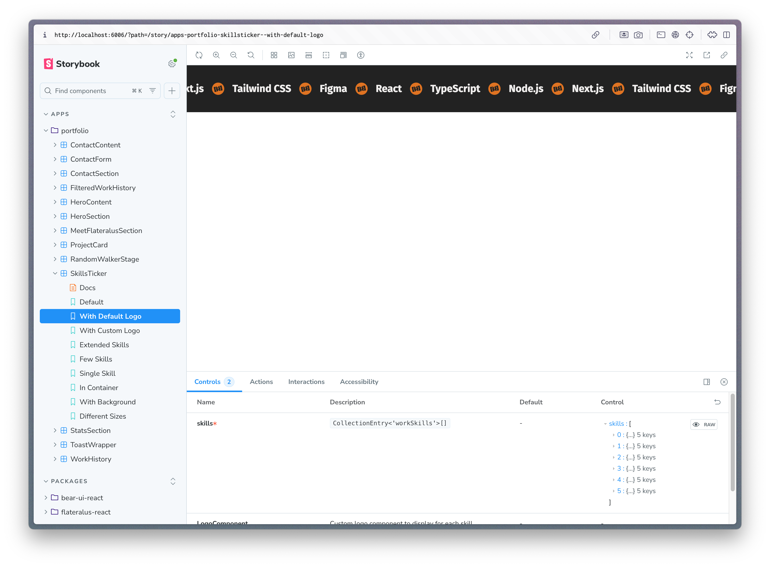
Storybook (single instance, multi-directory)

I run one Storybook that aggregates stories from apps and packages. Each story shows where it lives. This makes reviews faster and keeps ownership clear: if a component belongs in the shared UI, it moves there and inherits tokens.

  • One place to exercise states and edge cases.
  • Easy visual QA during refactors.
  • Encourages reuse without policing it manually.
Storybook interface showing component documentation and preview
Animation

Flateralus Animation System

Generative visuals are great until they eat the frame budget. Flateralus keeps them in bounds with a schema-driven control system that provides typed controls, visibility-based pausing, and intelligent performance guardrails.

The Control System Pattern

The heart of Flateralus is its control system—a schema-driven approach that defines animation parameters as TypeScript manifests. This pattern provides several powerful benefits:

  • Type Safety: Control types are automatically inferred from schemas, providing compile-time validation
  • Runtime Validation: All control values are validated using Zod schemas with automatic error handling
  • Performance Optimization: Controls can be marked as "reset" (expensive recalculation) or "dynamic" (smooth interpolation)
  • Debug UI Generation: Automatic UI generation for animation parameters during development
  • Framework Agnostic: Works across PIXI.js, p5.js, and custom rendering backends

Why This Pattern Matters

This schema-driven approach transforms animation development from ad-hoc parameter tweaking into a structured, maintainable system. Instead of hardcoding values or manually managing UI controls, you define your animation's interface once and get type safety, validation, and automatic UI generation for free.

The pattern scales beautifully—from simple bouncing balls to complex particle systems with hundreds of parameters. It enforces good practices by making expensive operations explicit (via resetsAnimation) and provides clear boundaries between what can be smoothly interpolated versus what requires recalculation.

Real-World Benefits

  • Developer Experience: No more guessing parameter ranges or forgetting to validate inputs
  • Performance: Automatic visibility-based pausing and intelligent update batching
  • Maintainability: Clear separation between animation logic and parameter management
  • Debugging: Built-in debug controls and performance monitoring
  • Collaboration: Schemas serve as living documentation for animation parameters
flateralus.ts ts
// Schema-driven control definition
const particleManifest = createManifest({
id: 'particle-system',
name: 'Particle System',
controls: [
{
name: 'particleCount',
type: 'number',
label: 'Particle Count',
defaultValue: 100,
min: 10,
max: 1000,
step: 10,
resetsAnimation: true, // Expensive recalculation
},
{
name: 'speed',
type: 'number',
label: 'Speed',
defaultValue: 2,
min: 0.1,
max: 10,
step: 0.1,
// Dynamic - smooth interpolation
},
{
name: 'particleColor',
type: 'color',
label: 'Particle Color',
defaultValue: '#ff6b35',
},
{
name: 'enableTrails',
type: 'boolean',
label: 'Enable Trails',
defaultValue: false,
},
] as const,
} as const);
// TypeScript automatically infers:
// type Controls = {
// particleCount: number;
// speed: number;
// particleColor: string;
// enableTrails: boolean;
// }
Testing

Testing & DX

Comprehensive testing strategy with automated quality gates and developer experience optimizations.

Testing Strategy:

  • Unit tests for utilities and business logic using Vitest
  • Integration tests for complex workflows and API interactions
  • Component tests for React components with Testing Library
  • Storybook for component states and visual regression testing

Development Workflow:

  • Husky hooks enforce code quality at every commit
  • Pre-push runs full test suite to prevent broken code
  • Pre-merge comprehensive checks before merging to dev
  • Branch protection prevents direct commits to main/dev

Quality Gates:

  • Formatting (Prettier), linting (ESLint), type checking (TypeScript)
  • Test coverage, build verification, dependency audits
  • CSS pattern analysis to maintain design system consistency

Pre-commit & Pre-merge Hooks: Every commit triggers branch protection (prevents direct commits to dev/main) and runs lint-staged for formatting. When merging into dev, a comprehensive pre-merge script runs: formatting checks, linting, TypeScript validation, full test suite, build verification, dependency audits, and git status checks. Only if all checks pass does the merge proceed.

Monorepo Testing Setup: Single Vitest configuration at the root handles all packages and apps. Tests are co-located with source files (e.g., utils.ts has utils.test.ts). Uses jsdom environment for React component testing with Testing Library. Aliases configured for monorepo packages. Tests run in Node.js with globals enabled for cleaner syntax.

Component Testing Pattern: Tests focus on accessibility and user behavior rather than implementation details. Uses getByRole queries for semantic testing, checks actual DOM content rather than props, and tests both happy path and edge cases. Each test is isolated and descriptive about what behavior it's verifying.

Security

Security & ops

  • Secrets stay server-side.
  • Security headers via Netlify (X-Frame-Options, X-XSS-Protection, X-Content-Type-Options, Referrer-Policy).
  • Tagged releases and a quick rollback to the previous tag if something looks wrong.
  • Dependency security audits run on every commit via pre-merge hooks.
  • Comprehensive quality gates: pre-commit, pre-push, and pre-merge hooks ensure code quality.
  • CI/CD security checks via GitHub Actions on every push and pull request.
  • Static site generation reduces attack surface by eliminating server-side vulnerabilities.

Release Management:

  • Synchronized versioning across all packages and apps using automated scripts
  • Git tags created automatically on each deployment (v1.0.1, v2.0.0, etc.)
  • One-command rollback to any previous release
  • Version bump commands (npm run version:patch/minor/major) sync across entire monorepo
Roadmap

What I'd change next

  • Replace the quick OKLCH threshold with APCA scoring across the board.

  • Add a token audit that flags unused tokens and over-used utility combos.

  • Ship an image modal/gallery that supports deep-linking directly to a specific image.

  • Script performance traces for animation presets so regressions are obvious.

Conclusion

Closing and repository link

If you want to see something specific—content shapes, token usage, or animation controls—reach out and I'll point you to a tight, focused example.

Ready to explore the code?

This repository contains the complete source code for this portfolio and all related projects.